
While I’m not going to make my deadline putting out the first chunk this month (it’s financially unfeasible), I’ve still done a lot of work since the last update. The previous post talked about the work I’ve done on the script. These are the more tangible changes I’ve made:
- Intro Page 4: Finished shading, page complete.
- Intro Page 5: Page felt foggy. The fog should dissipate with the tension rising in the scene. Pumped up the shadows. Re-ordered the layers so the light doesn’t eat the figures.
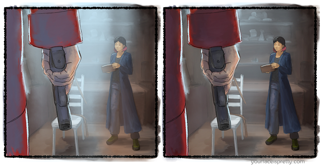
Intro, Page 5
- Intro Page 8: Finished color. Dannika did a real nice job helping color this one.
- Intro Page 9: Didn’t pick my battles wisely on this one. Turned out well, but Dannika and I fought with it. Still missing a little bit of detail. I want to put a gnarly scar on the guy’s pointer finger.
- Intro Page 10: This isn’t going to updated on the site, because the changes made so far make it less legible. I am, however, relatively proud of myself for penciling the skeletons without a model. I really need to get better at figures. My lack of control over body gesture is really frustrating.
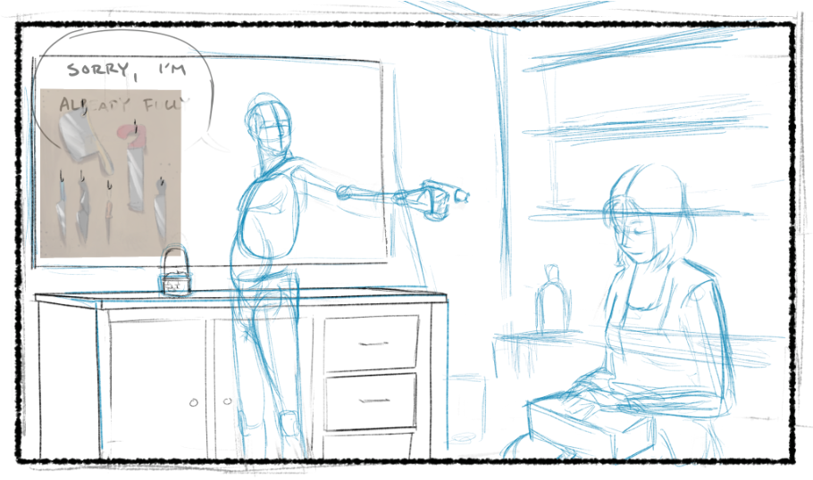
Intro, Page 12 is a bit of a mess right now.
- Intro Page 11: Small change to dialogue. Changed “But if your ‘team’ finds out what you really do” to “But if your ‘team’ finds out how you really do that“. Kaya doesn’t doubt that he’s accomplishing something, just that anyone would knowingly work with a murderer.
- Intro Page 14, 18: Moved the point where she puts out her cigarette. Partly because it was killing momentum, partly because… because character reasons, that’s why.
- Intro Page 16, 17, 18: Skootched things around to emphasize a difference between Kaya and the chief of police. In this case, the chief uses a standard villainous monologue. In other drafts, she actually called him out on his false dichotomy. Calling out people’s logical fallacies makes her feel cool. In this case, however, since the art has presented her as pretty cool so far, a line like that would make it seem like I was the one trying to look smart.
So I doubled down on establishing that this isn’t her first rodeo in a murder room instead. - Intro Page 20: Moved the panel with the door knock. We already know the cops are at the door, so it’s not a good frame to ask for a page turn. Having her stop and consider what to do about it motivates that page turn better. I think there’s actually a better layout out there for this page, but I don’t know if I’m going to find it before I have to ink.
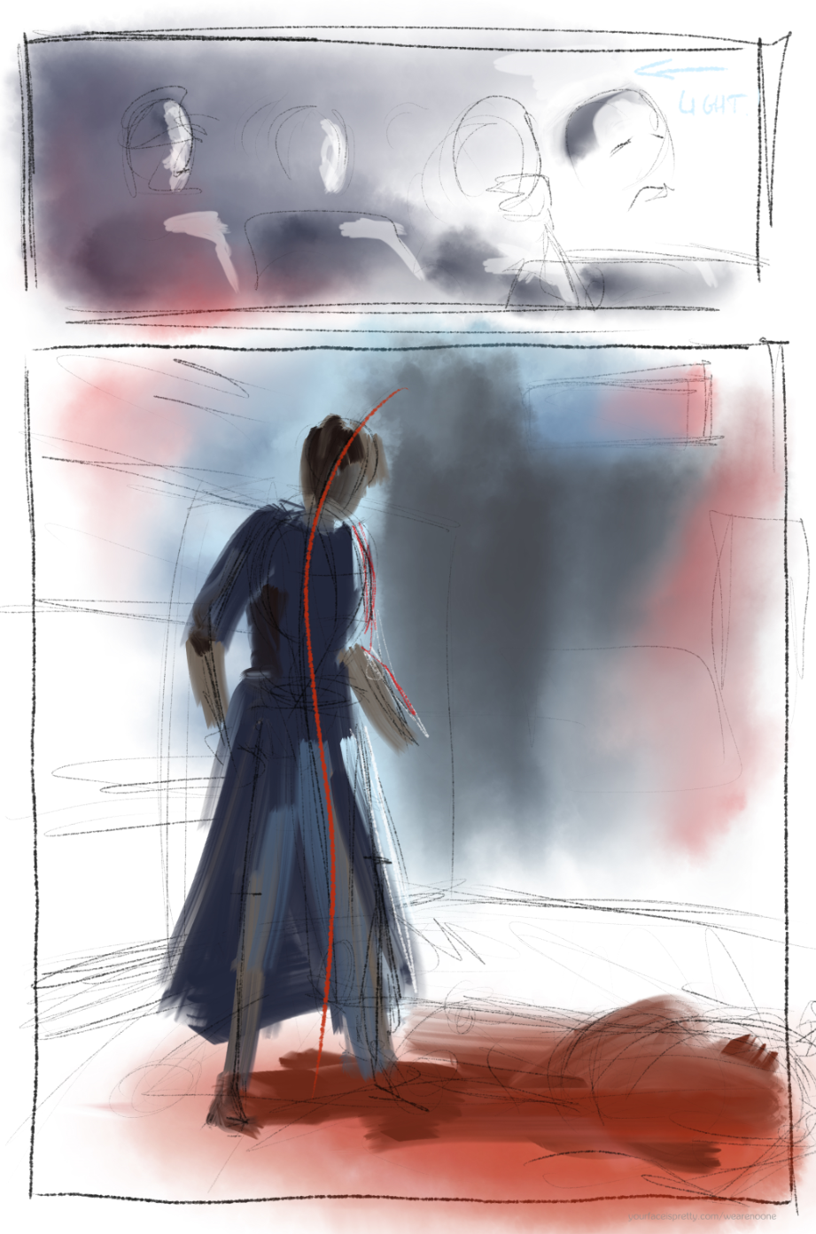 Intro Page 21: I gave this page more room. Pulled back out of the murder room for the last shot, so we have a second to try to figure out what she’s going to do. And maybe some readers will consider what she’s thinking about, looking at those bones.
- Intro Page 22: Added a page to establish exactly what the outcome of the scene is. I tried being more understated about it, but it didn’t read. I do that so often in my writing: I pull the reins too hard and end up facing the wrong way.
I was concerned that showing too much of this murder, with too good of an aesthetic, would elevate the act. I don’t like violence. Showing it, but making it ugly instead would mostly eliminate that problem, but at the unreasonable price of making this story far more emotionally exhausting than I want it to be.
The only other option I saw, initially, was to just leave the images out, as much as possible.
But then people had weird misunderstandings. The last straw was when I had someone tell me they thought that Jesse was the Chief of Police. That probably isn’t a mistake anyone would make with a fully rendered comic, but it was still concerning that he considered the Chief a player in the story after the first scene.
Additionally, leaving it out neuters what should be a very dangerous character. That’s unacceptable. All the tension of the first half of the story relies on her being a threat.
The solution I finally settled on was to play up the human emotions. Show the guards disgust and horror. Allow Kaya to emote fully. I’m going to trying pulling a bit of a dutch angle there in the final. I usually don’t like how overly dramatic that effect is. However, I think making her act planted and strong in physicality, but undermining her with that camera angle might work for this panel…
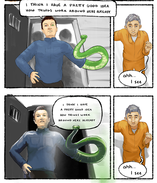
The standard approach would be to tilt her backwards… toward the left of the panel… I wonder what it looks like if I tilt her forwards… - Scene 1, Page 2: Fixed the size of the folder, because it was tiny. Fixed a typo in Jesse’s docs. A line was missing. Can I just say again how happy I am that Jesse’s mugshot is actually on model now? I’m so happy about that. Not knowing who you’re looking at in comics is one of my big pet peeves.
- Scene 1, Page 7: Changed the line at the bottom from “He confronted his friend, and Borodin let him bleed out slow” (which I hated immediately, but needed for information), to “he confronted him, and it went… poorly”. Changed some other small things to talk about Jesse’s actions/intentions/whatever this is really hard to talk about without spoilers.
-
Scene 2, Page 7, still bad placement on the wordbubble
Scene 1, Page 12: Almost done with this page. I want the photo of the Wall of Conspiracy to have actual content on it. Also made the prescription on file a photocopy, because the court wouldn’t have the original, you give that to a pharmacist. And I fixed the date. I don’t know how I keep messing up dates this bad. He did not get this prescription while in jail. By the time he was arrested, he no longer trusted the authorities. 2010 he visits a psychiatrist, 2011 he’s arrest, 2012 he’s sentenced, 2013 he’s transferred to a higher security facility.
- Scene 2, Page 6: Finished coloring. Should be done now. I don’t love my shading on hat-guy. But it’s functional. He looks as scary as Jesse looks tiny as Norm McSnakearm looks nonplussed.
- Scene 2, Page 7: Added some darker shading throughout. Did minor touch ups to make the old Jesses look more like how he’s supposed to. Like, making his nose a little shorter and rounder. His jaw on this page is still too weak and narrow, but I’m just going to live with that, because I like his expressions.
That final panel though… someday… I’m gonna re-do that with an actual reference so I can show his feet. I absolutely could not get that foreshortening to work. But he doesn’t randomly have Tyler Joseph’s eyebrows anymore, so that’s good.
Also re-colored the snake-arm panel. Went slightly “Jesse-vision”. I dunno if I actually like this coloring more or not. But it sets up for “Jesse-vision” panels later.
I definitely needed to fix the word bubble… but I’m going to need to do a little more with that, as it’s currently beheading the snake, and that’s no good. - Scene 2, Page 23: Resolved note, “add panel of scared guard?” I didn’t add it: I added stuff to clarify the scene elsewhere.
- Scene 2, Page 24, 25: This is that elsewhere. This one was a long time coming. I really fucked up this page initially. I tried to re-frame the scene so that it was about Jesse’s reaction, more than whatever was happening in the fight, but I didn’t set myself up well for that, so it felt like dropping the ball on a lot of shit I’d established. Also, I’d messed up and not given the guards guns for some reason, so I had this random un-established character show up with guns halfway through. Like… what the heck was I doing?
Meanwhile, the pacing is real weird, as we hang on this panel on the second page that we’ve been looking at through the whole scene (the angle should change here, past self. There was a shift in dynamics three pages ago, what are you doing? ¬_¬). I get what I wanted here. But repetition is going to establish this way better than bringing your scenes to a screeching halt with oversized panels, past-self.
And then, I did this weird thing, because I was concerned that I was being too rough on Jesse: I didn’t show McSnakearm being a dick to him. Why would you not show that, past self? And the logic of McSnakearm pushing him through the door is made even weirder by it happening on a page turn. I mean, no one was curious how McSnakearm was going to respond to these nonsense things Jesse’s saying. No one knows enough about either of them to have any idea that this would be something that McSnakearm would be bothered by to begin with.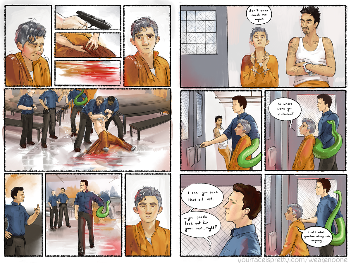
Page 24 and 25, the old version
So, I cut the rando guard, replaced him with the old guy McSnakearm’s been dealing with the whole time. The point is, McSnakearm is pissed that the old guard would use a potentially lethal weapon against someone who was, he thinks, under control. I did a reaction shot to this, instead of to McSnakearm’s approach, because that was a far more interesting reaction to see.
We wrap up Jesse’s scene with Beetle (his name is Beetle, the guy with the cute food tats), as he ties off that bit of manipulation. Then we can give Jesse’s mini-scene with McSnakearm the even sequencing it needs.
I needed to put more pressure on Jesse here (that is literally why I built Norm McSnakearm), but it wouldn’t really make sense for the guard to really do anything serious to this little guy: Jesse is not a threat to him, he’s a nuisance. Thus, head bonk. And that’s a nice little segue into Jesse being pushed into the next room. Speaking of…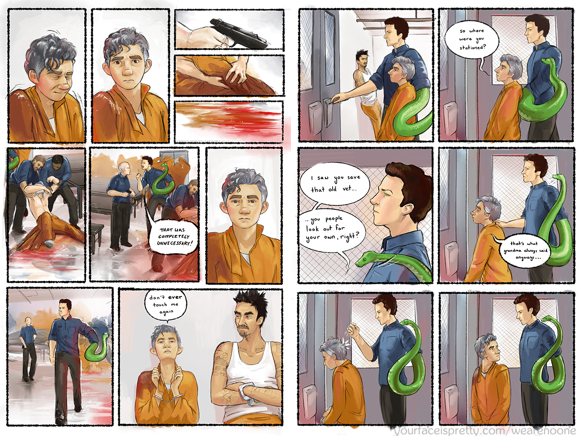
Page 24 and 25, the new version. With head bonk.
- Scene 2 Page 26: I’ve hated the color on this page for a long time. I think what I wanted was a room that looked like it was supposed to be seen by the public. Putting a good coat of paint on a bad place. But in practice, making everything blue just looks flat and boring.
Scene 2, Page 26: Fixing crummy layout with better color.
At first, I tried making the back wall dark. I didn’t want to lose the way the next page looks, with the bright blue back-light, so I tried making the wall we couldn’t see darker…
Terrible idea. I’d forgotten that part of the reason the walls were bright was because Patrice looks so good on light backgrounds. Worse, I couldn’t get the background to contrast enough with Jesse’s hair, and had to add bullshit lighting effects, just to get him to appear at all. Ugh.
Then I realized… having added that light, who cares what color the walls are? I cheat light all the time anyways. So I did the two side walls dark. Immediately, the first frame looked better. That frame within a frame that I’d built in my lines suddenly actually looked confining, like it was supposed to. So I did the floor and ceiling too.
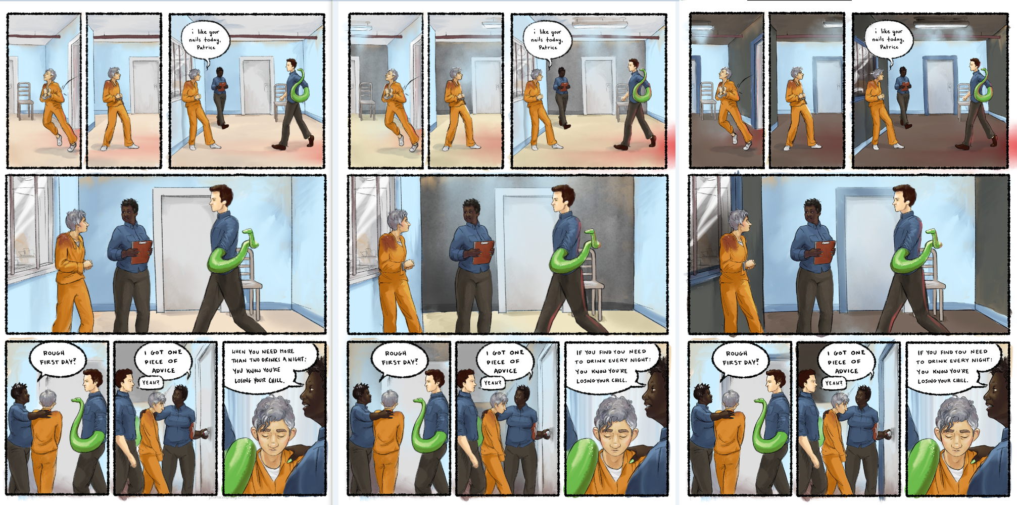
I also shifted that terrible, muddy pose of Jesse’s in frame four. I guess past-self couldn’t decide if he was moving toward Patrice or backing against the wall, and just went with absolutely nothing.
My partner Graham says I should change panel two so he’s less stable. When I can visualize how to do that without spending an hour redrawing his legs, I will do that. I hate legs sometimes.
I changed the final line to be less specific about the number of drinks one should be concerned about. Graham had a good point: he said that her intentions were unclear because he wasn’t sure what the number meant. Removing the specifics makes that cleaner.
Whew! Okay! Yeah. That’s what I’ve done in… a little more than two weeks. Well… I’m not as far as I wish I was, but that’s not nothing!
Amazing to follow your careful process. This is how creation happens, in starts and stops and stammers and ecstatic revelations. Enjoy!
Make a more new posts please :)
___
Sanny