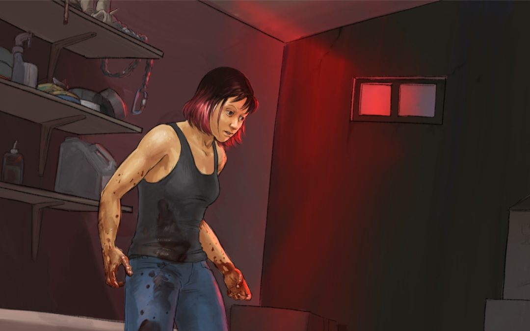
I’m going to call this “The Minimum Viable Product Release #1”. Because I got so frustrated not having enough time to actually ship finished pages, that I switched over to just trying to get enough legible stuff down that I can actually get feedback on full scenes. Having to explain stuff to a test audience is not my favorite thing. So, every single panel that’s up, now has at least *some* kind of drawing in it. I mean, some of them seem to be populated by vaguely people-shaped tornadoes (especially in the fight sequences, which’ll take some extra finagling so get right in the end), but there are *images*.
Also, I added another scene on the end, so you all can meet the nameless person who sometimes goes by 1616. And holy crap, we finally get to go outside. I was so sick of that prison. All these tiny dark rooms, the cement, all the orange, I get to draw plants soon. Plants, y’all. It’s gonna be great.
Anyways, let’s get this update rolling:
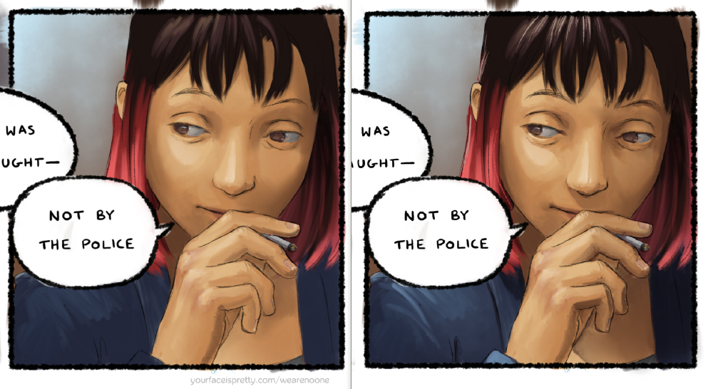
Intro, Page 8 Old on the left, updated on the right.
-
- Intro, Page 8: Minor update to the expression and face structure in the final panel. Her eyes are her only really distinctive feature, and they looked too boring in the last version. Also, the whole panel felt plastic.
(Hmm. I need to remember not to go so hard on neck shadows with people who have thicker necks. The jawline on the chief is weirdly youthful.) - Intro, Page 10: Panel borders, lettering done. Roughed in some color to make it a little clearer.
- Intro, Page 13 through 15: Okay, this is going to take some explanation. I completely reworked the second half of this scene for a few reasons.
First of all, because I realized that by giving Kaya an injury, which immediately and dramatically affects her mobility, I get to show that I am not doing “hollywood healing“. No. If you get hurt or sick in this world, there’s a chance you have to play the rest of the story out as a cripple. That’s life. This is no power fantasy.
Second of all, spectacle fighting serves neither the character, nor the theme of this story. Kaya is extremely practical, as long as she’s keeping her cool, she’s not going to do moves that are unnecessarily complex. The fights she gets in are fast, brutal, and actually kinda mundane. Thematically, I really don’t want to make her look overly um… “elevated”. Yeah, I think elevated is the right word. If she’s framed wrong, I’m going to run into some serious thematic dissonance (if I’m not getting that already. :P ).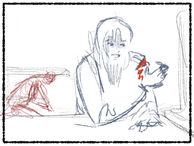
This is now a significant injury.
So. In pages 13 and 14 I had planned a sequence where Kaya disarms the Chief of his (already unloaded) gun, as well as a knife she didn’t know he had. However, she gets nicked in the process Then she would take a second to make sure she didn’t loose her tempter, and cuts him right back, eye-for-an-eye. In the following pages, the Chief re-armed himself with a golf club.
Instead, I emphasized the important part, by letting that small cut become a quite large injury. It severs a good portion of the anterior and lateral deltoid (shoulder muscle), preventing her from properly raising her left arm. I also cut back the complexity of the blocking, by letting the chief keep the knife. I tightened this whole sequence so much, I got to drop a page–which is awesome.
Side note: If anyone out there has expertise with fighting and wants to do some consulting to make this stuff more convincing, I’ll trade you art.
- Intro, Page 8: Minor update to the expression and face structure in the final panel. Her eyes are her only really distinctive feature, and they looked too boring in the last version. Also, the whole panel felt plastic.
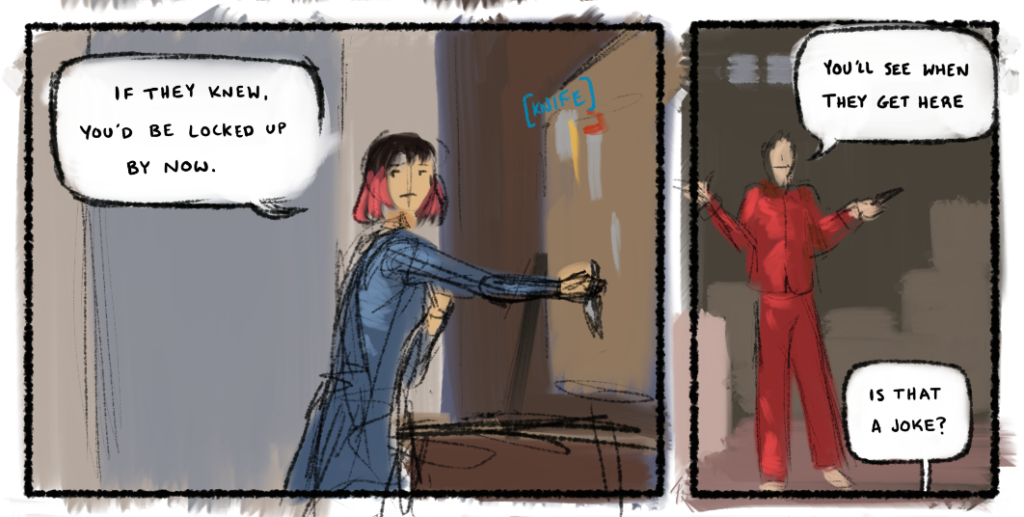
Intro, page 15: Kaya grabs a knife, babying her busted, left arm. The Chief shows how much faith he has in his team.
- Intro, Page 15: Changed “If they knew what you were, they’d kill you” with “If they knew, you’d be locked up by now.” Undoubtedly, Kaya believes in her core that most people would want to kill any killers they found out about. After all, a person who doesn’t believe in the value of life should, logically, be judged by the same standard. But she also feels that law enforcement, while definitely attracting a lot of power-hungry people, would also pull in people with especially strong will-power and a desire to rise above base human instinct. The idea of being an officer has an appeal to her, so she would believe that most officers are noble sorts of people. Outside of the story, it’s nice to reduce the level of drama. I really like watching normalcy bias in action.
- Intro, Page 16, 17: Yeah, redrew all this stuff. Just roughed in for now.
- Intro, Page 18: Redrawn with a single message in mind. Just pencil and quick swaths of color for now.
- Intro, Page 19-21: Redrawn to show a much simplified story. Kaya wins the fight because she stays on her toes, and tracks the distance between herself and her opponent. Her measured, focused movements are in contrast with the Chief’s wild emotional attacks. I’m not entirely happy with the acting on these pages yet. She’s not having enough fun.
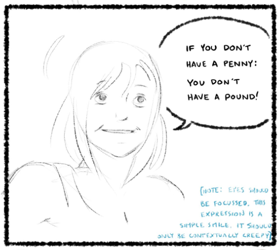 Intro, Page 21: I gifted Kaya with a new(ish) quirk, to try to show how her brain works. She’s the sort of person who consciously develops heuristics to live by, so she can fit in with other people. So she’d pay attention to old adages, in case they revealed how she was “supposed” to behave. But then, she’s not the sort of person to remember poetry, she’d only remember her literal interpretation. The result is mangled sayings that are logically sound, and directly applicable to situations… but that come off weird (and occasionally creepy) to “normal” people.
This particular line “If you don’t have a penny, you don’t have a pound!”, shows a little more of her thinking in this scene, that she’s got nothing to lose. And the language is nice, since she literally is out of money.
(My last pass on this scene is probably going to be roughing up her clothes a little. Making her look a little more down on her luck. Er… let’s be honest, she’s not unlucky, she just hates people too much to hold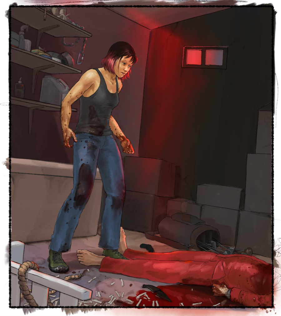 down a job.)
- Intro, Page 22: The big panel is basically done. Inked and colored. I was right, tipping it to the right made her look good and unstable. I didn’t use any forced perspective, for fear that it would make her too heroic. But I put the camera a little below waist height so she still has plenty of power.
My only concern is that my original composition used more blue to balance the image. I might be able to get even more pop out of this with a more blue… But it might also make it feel more theatrical, and I don’t need that.
The upper panel needs some good reactions from some police officers. So I’ve got to design some characters for that. Probably with really good bottom lips, maybe some jowls. If they were older, their foreheads would wrinkle more. All of these things would play up the expression of horror.
I’m going to stop here for now, even though I’ve got a lot more pages to update. Heck, I’ve got two entirely new scenes to upload. But I need to get a little paid work done today too.

