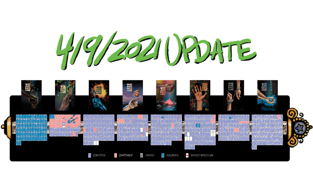
Updated absolutely every page, to unify size and quality for web, and put a little website mark at the bottom. I don’t love putting words on stuff like that, I find it distracting. But you know, Pinterest and repost accounts exist. I was just frustrated the other day by a super rad video of someone drawing, but it was more than a few layers deep into the repost hole, and with no identifying features, I couldn’t find the artist. So for the sake of reverse searchers everywhere: website info.
In other news, as you’ve probably heard, I’m a push of a button away to finally, FINALLY releasing book one. No, I still don’t have a release date. I still feel sheepish from all the times I’ve felt like I was this close, but wasn’t, so I’m not giving dates until I feel secure.
I mean, I’ve never done a book release before. I have to figure out the marketing and outreach side of things. But soon. And I’ll keep you all posted. Because I want a big, big party, especially after this awful year of isolation.
Also, I have Youtube Channel now, check out my first video, if you haven’t already: Your Face is Pretty – YouTube
My new computer can handle screen-capping its massive 3000×2000 screen, and I have a secondary machine that can film the “hand-cam” simultaneously. I’m working on figuring out livestreaming too, but that’s been a little trickier. I’m just going to have to spring for a capture card, there’s really no other way to get a screen this big, doing work this intense, streaming without lag.
Okay, now strap in. This page changelog is going to be gigantic.
BOOK 1
Intro, Page 1: Brightened and added stars. They weren’t showing up well in print. I liked them so much I decided to keep them for online too. The moon is also in a slightly different place, because of the shape of print pages. Smaller image for web.
Intro, Page 2, 3: Smaller image for web.
Intro, Page 4: Higher quality image.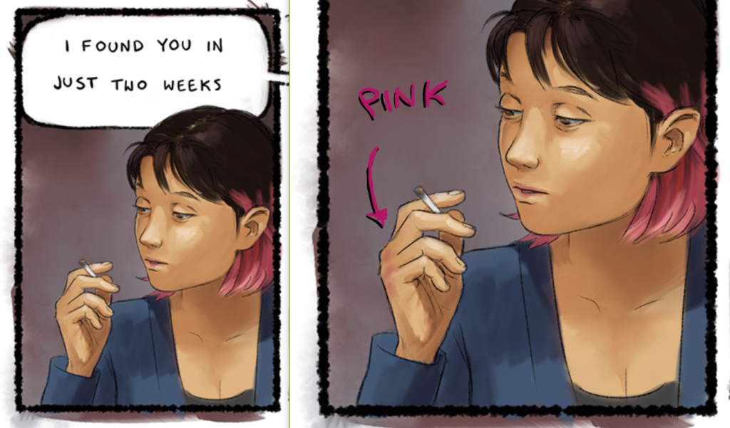
Intro, Page 5: Added more pink to Kaya’s knuckles. This is now a character design feature, because I like being able to tell who’s hands are who’s. Higher quality image.
Intro, Page 6: Higher quality image.
Intro, Page 7: Higher quality image. (Has anyone else noticed that there’s zero consistency around what color the Chief of Police’s eyes are? Oops. Pretend he’s a cyborg or a vampire or something. I don’t want to open these pages again until at least book four.)
Intro, Page 8: Knuckle pinkness. Higher image quality.
Intro, Page 9: Smaller image for web.
Intro, Page 10: Minor face touch-up on last panel, I think. I think that was a recent edit, I don’t remember. It’s been a long year. Higher quality image.
Intro, Page 11: Higher quality image.
Intro, Page 12: I sure do wish I were better at anatomy, so Kaya looked as tense and ready for a fight as she should. Some day, some day. Much higher quality image. Wow that one looked bad.
Intro, Page 13: Higher quality image.
Intro, Page 14: Strangely, this new image is smaller in pixels, while very slightly larger in file size, but it looks basically the same. Jpgs are weird.
Intro, Page 15 – 18: Higher quality image.
Intro, Page 19: Oh crap! There’s a random old water mark on this image. I’d better make sure that’s not in the print pdf. It totally is, isn’t it…?

No… no, the proof is fine. Where did this come from…? Oh I get it. It’s because the print document uses a fancy bleed-friendly file. Okay. second watermark is removed, and the image quality is better.
Intro, Page 20 – 23: Higher quality image.
Scene 1, Page… Oh here’s where we get into the fun stuff. Added Page 0, which is a title card, just to orient ourselves as we switch scenes.
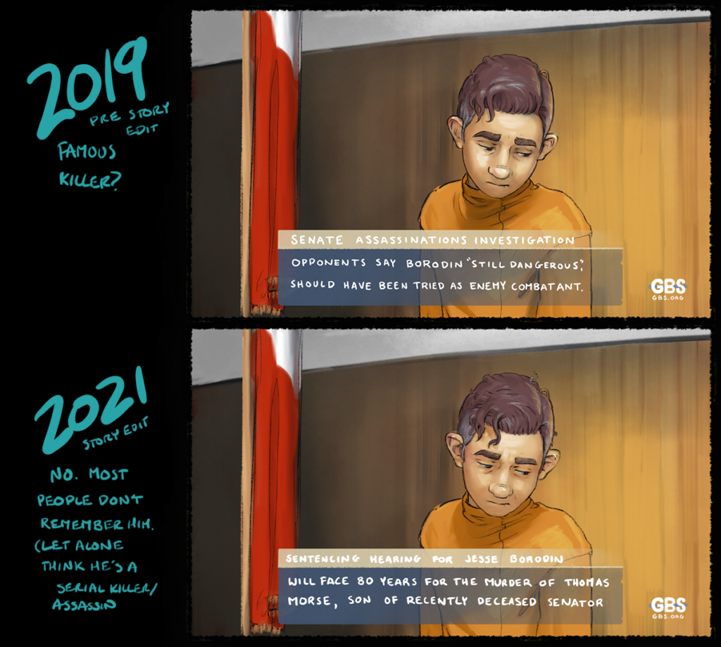 Scene 1, Page 1: I swapped out ALL the text on this page. Used to say…
“Senate Assassinations Investigation:
Jesse Borodin gets life in plea deal.
Widow and mother of deceased, Linda Morse, says deal ‘Right choice’ for ‘grieving country’.
Opponents say Borodin ‘Still dangerous’, should have been tried as enemy combatant.”
Updated to…
“Sentencing Hearing for Jesse Borodin:
Prosecutors seek death penalty.
Secretary of State, Linda Morse, speaks on behalf of her son’s murderer.
…will face 80 years for the murder of Thomas Morse, son of recently deceased senator.”
This is part of a sweeping change I made to Jesse this year, that sort of turns his backstory on its head, while greatly clarifying his motivations. Formerly, almost everyone knew who Jesse was, and that he was accused of killing five senators and a senators son.
Now, only the odd conspiracy theorist associates him with the Senate Murders or the Cabinet Killer; most people have forgotten his trial; and he was only ever charged with the murder of his Roommate, Thomas.
One, as I think I said in the script changelog, this makes it easier to explain why Kaya is skeptical of someone asking her to take this guy out. Not believing that he has anything to do with the Senate Murders is the default state for this society.
Two, it means that when Jesse tells people he’s actually a big bad serial killer and they should leave him alone, he has to work to sell that story.
Three, it frees up space to put emphasis on Thomas and who he was to Jesse. This whole scene has gotten a glow-up to make Thomas more memorable, because we’re going to need that relationship as a comparison point.
Four, it cleans up Linda Morse’s small role in this. “Speaks on behalf of son’s murderer” is a lot more emotional than what I had before; and we lead with her position as Secretary of State which seems like it could be a pretty important fact about the case.
Oh, and I fixed Jesse’s face. Again. Because apparently two years ago I didn’t know how to shade a sphere. Bleh.
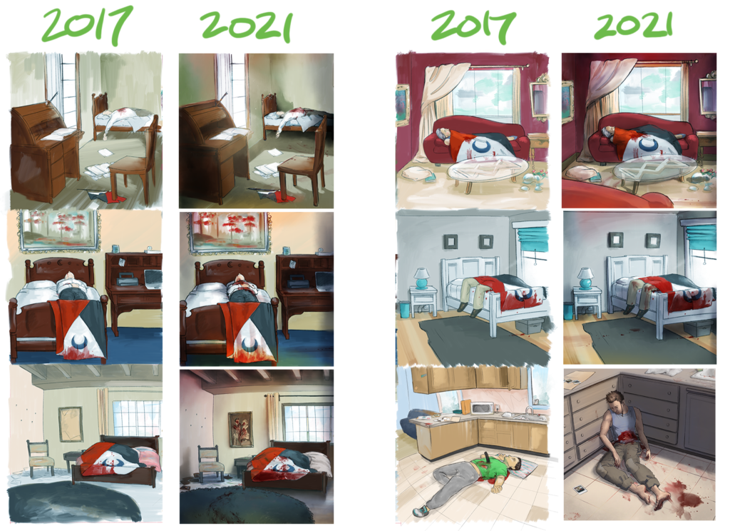
Scene 1, Page 2: All the crime scene photos have been revamped. Some more than others. Thomas’ had to be redone entirely, since he now actually has a character design – not to mention a character, and some details about the actual event have shifted in very meaningful and specific ways. That made the rest of them look out of place in a different way than intended. They didn’t just look like a different kind of murder, they looked like they either weren’t photos, belonged in a different world, or were less important. Heck, I realized the one with the dark blue circle rug wasn’t even finished. I finally added relatively important details to that one. I mean, very relatively. This is still like, tertiary story stuff.
Scene 1, Page 3: Minor touch-ups to Kaya’s face (her nose got longer and more realistic three years ago; this is a very, very old page). Knuckle pinkification. Murder image is brushed up. Changed dialog to reflect the switch in Jesse’s backstory.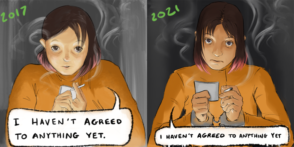
Scene 1, Page 4: Completely redrew two panels because they were ancient and I hated them. Okay, that’s not true I always liked the general look of the second, it just stopped looking like Kaya exactly, years ago. I think I did a pretty good job emulating her spooky eyes, while updating her mannerisms and face design, and costuming.
Scene 1, Page 5: I really can’t believe I managed to resist redrawing this one. Wow those are some old panels. I just keep telling myself that I can wait until the very end of all of this, and it’ll take less time then, because I’ll be better. Anyways, making a comic that’s uniform in style and skill is a wild goose chase; and I can print panels I hate, but I can’t print blank pages.
Scene 1, Page 6: Murder image updates, redrew the last panel because Kaya shouldn’t be making so much eye contact, and much higher quality image.
Scene 1, Page 7: Thomas’ murder scene. This one is big. It’s been entirely redrawn to really, really try to make people remember this particular person, this particular body. I also have a plot about reusing this for something, so it’ll be worth it to have large images where all the little details are clear.
Scene 1, Page 8: It hurt me to cut that knife and fingerprint panel, but we gained Wall of Conspiracy, which is a way, WAY bigger win. Jeez this thing took so long. I’ll probably keep adding detail to it too; there are a couple areas that aren’t as fleshed out as I’d like… but it’s totally shippable as is.
Overall, this page has gone from being very plot-focused (presenting evidence), to being more about identity and emotions. I got to suggest that Kaya has opinions about calling someone psychotic; to continue to show Kaya’s ineptitude at reading other people’s emotional states; and I got to establish that she’s never tried to kill a friend, which… I dunno… might be important later.
Scene 1, Page 9: Slid those fingerprints back in here because I needed a quick and easy panel, and I like them. Half-way cleaned up the lines (but didn’t worry too much, since in my experience, people blast through this scene). Pinkified knuckles (but forgot some of them, oh well.)
Scene 1, Page 10: Little clean-up. Higher quality.
Scene 1, Page 11: Some day I’ll completely redraw this page. That time is not now.
Scene 1, Page 12 and 13: Oh my gosh, I’m so glad this didn’t break my php template. I had to turn this into a full-page spread because I had so much to show, and I really didn’t want to break it up into two awkwardly split pages for online. I don’t like that it’s visually smaller than long pages, but so it goes.
Added a snapshot of Jesse and Thomas*. Decided to do a photocopy close-up of the wall-of-conspiracy here, since it got it’s own half-page earlier, but not in a way that the text was very legible.
Fixed Jesse’s mugshots. His face was too wide, and I had to re-export them anyways. I also made the bruising in the 2012 mugshot more obvious.
Scene 2, Page 1: Just words on here, just a different website thingy at the bottom.
Scene 2, Page 2: Smaller file size for web.
Scene 2, Page 3: Oh… I didn’t think about this page. Shoot, does that letter make any sense with the change to Jesse’s backstory? Is that still helping? I mean, it shows a rejection of whatever the heck that person is writing to him about, but that’s not exactly a subversion, since the audience has no reason to expect him to like that kind of attention. Worse, if his goal is to come scary to other people, he should be into that kind of mail. Shoot shoot shoot… What do I do about this? That was supposed to be a placeholder letter anyways. I always expected to replace it.
Ah! It needs to be a letter admiring his research! Yes. That’s a thing that he regrets and is scared to think about. That won’t take long to rectify and reupload before publishing.
Ok, here’s what I just did. I changed the text, obviously.
Since this is very obviously from Jesse’s perspective, I also added some of the color distortion and vertical smearing indicative of his view of the world.
When I started drawing this whole thing, I wanted to take a more third-person approach to drawing. I’d like to say this is because I was trying to avoid melodrama, or that I didn’t want to manipulate the audience’s feelings (when movies do tear-jerker shit and make me cry with music, when the writing didn’t earn it, it pisses me off), the truth is that being emotional is vulnerable – even when they’re not even technically my emotions being expressed.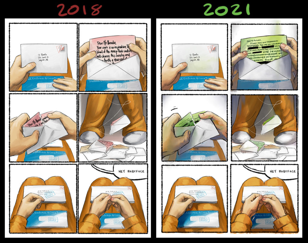
It was only after I’d drawn this scene that I really started accounting for the wiggliness that comes from showing scenes from different character’s perspectives. Breen’s view is bright, and relatively simplistic. 1616’s view is textured, joyous, and more than a little psychedelic. Kaya’s view is structured, highly technical, washed out (with some specific exceptions). And Jesse sees things darker, scarier, but also on the realistic side, and distinctly people-oriented.
You might also notice that I switched the letter from red to green. It’s representing a different idea now, so it fits in more with ‘Norm McSnakearm’ than ‘blood on the floor’. (I’ve got to do a video about ‘why symbolism’ at some point. I’ve got a lot to say about it, and it takes longer to write than it does to say.)
I really like the way this makes these pages fit in with the color scheme of the rest of this scene.
I also cleaned up Jesse’s fingers a little. I’ve been practicing drawing feet, and its improved my understanding of nail beds.
Finally, I tried to heighten the shakiness in the final panel. I’m still having a really hard time with that effect. This is the kind of thing that people who learned comics first blast through, but with my more traditional realistic experience, I struggle.
Scene 2, Page 4, 5: Aw, they’re so old and ugly, it’s cute. <3 Optimized for web.
Scene 2, Page 6: Better shading on final panel.
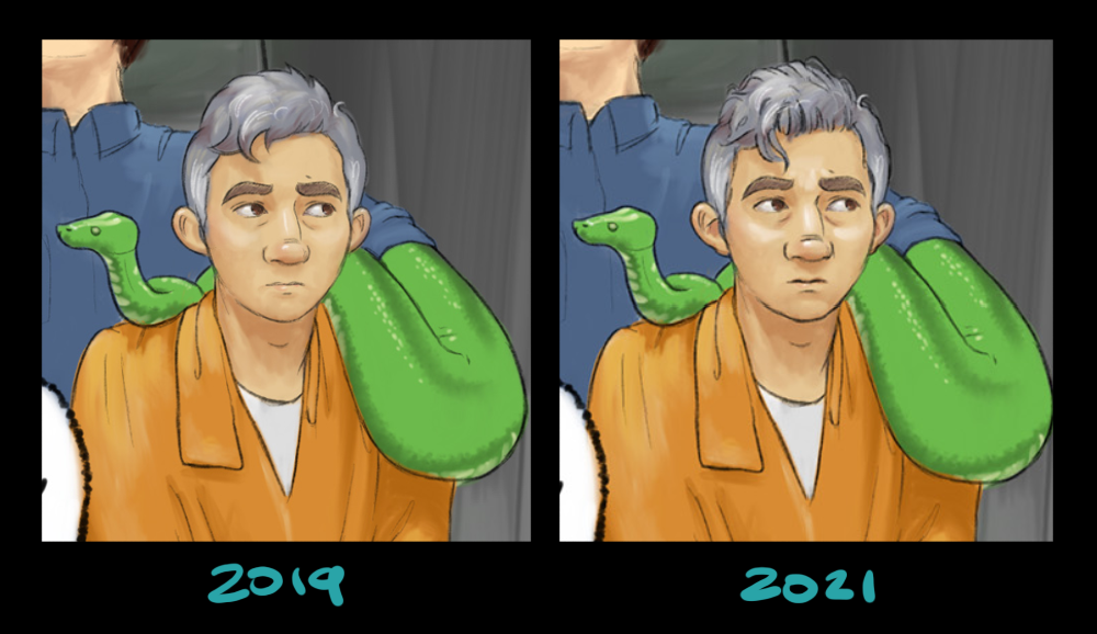
Exhibit A: “Perfectionism”. Can you spot the difference? :P
Scene 2, Page 7: Tiny hair curl continuity fixes. Optimized for web.
Scene 2, Page 8: Hair curl continuity. Quick ‘n dirty pass to clarify expressions, and try to pull Jesse’s face towards its correct shape.
Still love that snake-arm. Snake-arm looking so good.
Scene 2, Page 9: Holy crap! This page is super outdated! I made that back wall purple, like, three years ago. Well, it’s fixed now. Oof.
Scene 2, Page 10, 11: Optimized for web.
Scene 2, Page 12: Wow, I guess I just never uploaded the big purple wall change. Or I messed up those uploads or something. Or maybe when I switched from hard-coded to PHP-generated pages I picked the wrong files. Also higher quality image.
Scene 2, Page 13: Someday, I want to shrink those top panels with the fight down, and use some mini tiles to emphasize the difference between Beetle’s (his name is Beetle) indifference, and Jesse’s feigned indifference. I didn’t do a good job showing that, and it was literally the original point of the scene. It does other stuff too now, but it’s a bummer that it doesn’t fulfill its original purpose.
Purple wall. Better expressions. Higher quality image.
Scene 2, Page 14: Entirely removed the panel border around panel two. It was already breaking through them, leaving it in only made the page feel crowded. Purple wall. Better expressions. Higher quality image.
Scene 2, Page 15: Purple wall. Better expressions. More spacious gutters. Higher quality image.
Scene 2, Page 16, 17, 18: Purple wall. More spacious gutters. Higher quality image.
Scene 2, Page 19, 20: Purple wall. Jesse face fixes (still not as much as I’d like). More spacious gutters. Higher quality image.
Scene 2, Page 21: Weird. This one has the purple wall fix already.
Change text to be more explicit: “You’re not the Cabinet Killer, you’re just a punk, with a big mouth.” He used to say “terrorist kingpin”, but that’s too round-about for the speed that people read. The point is, Jesse is in more danger if he’s not seen as the Cabinet Killer. Specifically that. That’s what we hung our plot on, that’s what’s important.
Scene 2, Page 22, 23: Purple wall wasn’t in these ones though. Now it is. I wonder what happened.
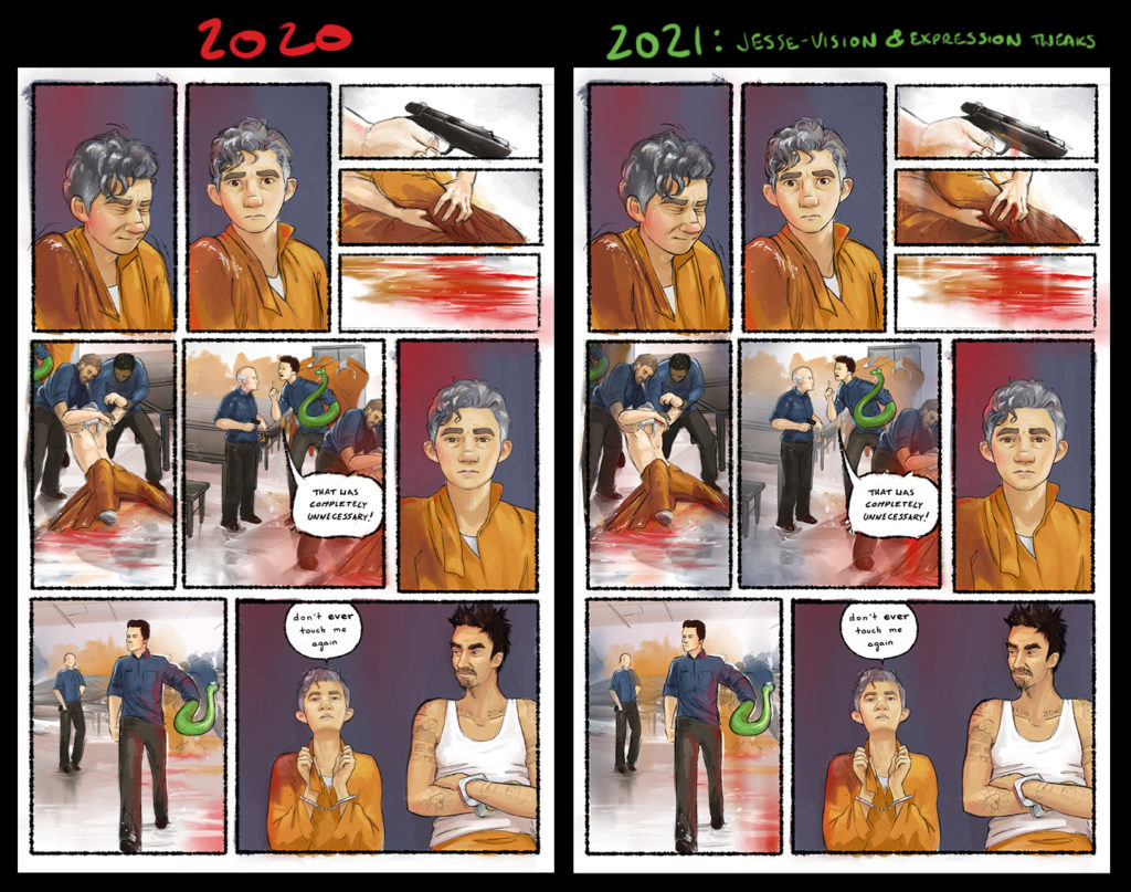 Scene 2, Page 24: Urghslkjgh… this page really should be in Jesse-Vision, and it’s not. Should I crack it open…? Yeah… with the changes to Scene 1, it seems worth it. Added some vertical smearing, vignette effects, and more blood (if people have made it through seven murder scenes, they can handle a very pg-13 shot to a leg.) Small changes to Jesse’s expressions: in panel two the lower-lip pouter muscle is now active, in panel 8 I went harder on ‘sadness’ and toned down ‘resolute’.
Strongly considered adding visual parallels between this and Jesse’s other, past experiences with blood and such… but that kind of visual language would tell people that Jesse’s reaction is one of personal trauma. That is one interpretation, but not one I’m interested in adding weight to. I’m not concerned with why Jesse reacts to this kind of stuff, only how.
Scene 2, Page 25: Thanks to Olive, I now know why Norm McSnakearm is so darn tall on this page. He’s standing on a box. Purple wall. Optimized quality for web.
Scene 2, Page 25: Optimized quality for web.
Scene 3, Page 1: I love this page and I will never change it. Optimized quality for web.
Scene 3, Page 2, 3: Higher quality image.
Scene 3, Page 4: Slightly widened Jesse’s jaw in all panels. Optimized quality for web.
Scene 3, Page 5: Hm. Looks like I greatly heightened Jesse’s expressions of discomfort. I don’t even remember doing that. I must have been sleepy. Higher quality image.
Scene 3, Page 6, 7, 8: Optimized quality for web.
Scene 3, Page 9: Higher quality image. Jesse’s ears are too high in the last panel. Heck, so is his head in general. Oh well.
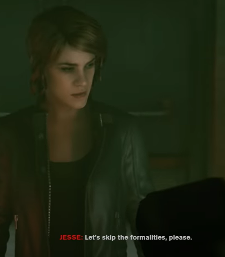
Scene 3, Page 10: Optimized quality for web. That first Jesse panel is giving me mad Jesse Faden “Let’s skip the formalities” vibes. But that’s probably just me. I’ve just played an awful lot of “Control”.
Scene 3, Page 11: Optimized quality for web. Okay, almost done, thank goodness.
Scene 3, Page 12: Oh wait no. This is only end of book one. And I need to update all of book two now too! This is exhausting. Optimized quality for web.
BOOK 2!
Scene 4, Page 1: Image size stuff, whatever.
Scene 4, Page 2: 1616’s (this person will eventually be called 1616) pants are now green. Higher quality image.
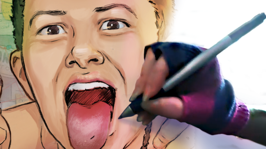
Scene 4, Page 3: Panel one now complete. Video of the process (and feet studies) upcoming. Higher quality image.
Scene 4, Page 4, 5: Higher quality image.
Scene 4, Page 6: Panel 3 complete. Higher quality image.
Scene 5, Page 1: Considering added a second scene card here, saying snarky something like “Location Super Unknown” or “Who Even Cares Anymore: Somewhere Else!” or something like that. This is the last time we switch locations in the ENTIRE script. I don’t know. We’ll see. Haven’t done it yet. Higher quality image.
Scene 5, Page 2: Going to need to spend a day designing the full Galvenian air-force get-up for this one. That’ll make a fun video/stream.
Scene 5, Page 3: Some quality penciling on 1616 in panel 1. Higher quality image.
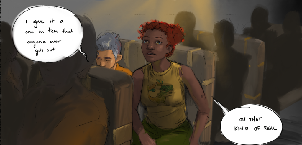
Scene 5, Page 4: Little perspective fix that happened to cover Jesse’s mouth. I didn’t like that at first, but now I kinda dig it. Added the dinosaur to 1616’s shirt. Higher image quality.
Scene 5, Page 5: Continuing to fight with these expressions. Ugh. Higher quality image.
Scene 5, Page 6: Woo! This page is hardly more than a sketch, but let’s throw it up here, because why not?! If I’m publishing book one, I at LEAST want all my main characters on-screen in some form.
Scene 5, Page7: In their minimum forms, Jesse is eyebrows, 1616 is smile.
Scene 5, Page 8, 9, 10, 11: Exist! And that’s about all I can say.
Scene 5, Page 12, 13: Yeah, these are missing panels. We’re just going to Kaya our way through this section, just bull-headedly shove a path through, so we can meet Breen.
Scene 5, Page 14: This one’s more than half done. That’s nice. :)
 Scene 5, Page 15: Breeeeeen! Excited about Breen! Not excited about the crowd I need to draw around him.
Scene 5, Page 16: Kaya attempts to act normal. Lots of this one is done. Don’t like my figure drawing on 1616 in panel 1 though.
Scene 5, Page 17, 18: These ones desperately need to be rearranged give the change to Jesse’s backstory. Uploading them anyways, because Jesse’s such a weirdo and Breen’s so out there, the awkward isn’t entirely unjustifiable.
Scene 5, Page 19: This one looks like nonsense. It’s 90% background detail, which is hard to sketch quickly and understandably.
Scene 5, Page 20, 21, 22, 23: It’s such a relief to look at pages with all four characters. I really can’t believe I originally tried to open this book with the most timid, least risk-taking character. Jesse does not drive scenes, he’s just not built for it. Even Kaya isn’t really the most dynamic character on her own. She needs someone emotional like Jesse, or non-linear like 1616, or Lawful Good like Breen to push against. I really should have opened with 1616… should I just called this blog post the “It is what it is” update?
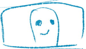
Sweet thumb boy.
Scene 5, Page 24: Sorry this is super blank. I’ve got to construct an entire set in order to draw this one. This scene is basically that bit at the beginning of spirited away where we run through our new location and get our bearings. The camp is fairly well designed, but it lacks some specificity, particularly in distances. I don’t have a very good grasp on how far things are from each other. I don’t want to end up with a location that feels like one of those big, mostly-empty, spooky PS1 game levels.
Scene 5, Page 25: Breen is a sweet sweet boy.
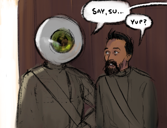 Scene 6, Page 1: This is it! According to our absurd social mores, this is now officially a comic for grown-ups, what with the full frontal nudity. Murder, fine. Woman casually being in a shower, adult content.
Kinda want to add pages here. But also kinda don’t ever want to add pages ever again. There are too many.
And it’s time to meet Isaac (pronounced EYE-saac) Mollar, a character designed and demanded by some friends of mine. He goes by his last name because he finds the pun a little insulting. He works in the shower because of his lack of eyelid (singular of course).
Scene 6, Page 2: Yeah… I think I need another spread of shower awkward to build up to this. I don’t currently have room for 1616 to start bothering Breen either, and we need that.
Scene 6, Page 3: Once upon a time there were more words on this page. Then I realized that tiny Jesse standing in front of enormous naked Breen said everything.
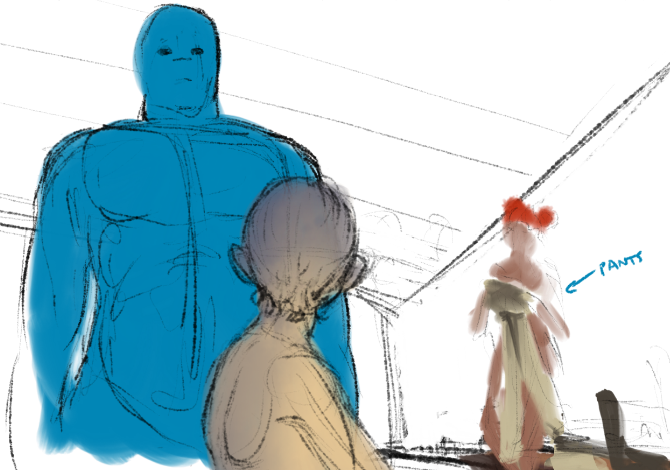 Scene 6, Page 4: Obviously coming to the end of what I’ve sketched (at least consecutively). Heh. D: Very empty page. I think I stopped because I suddenly realized I had a mini-action sequence and I wasn’t sure how I wanted to handle the uh… giant blue swingy bits situation. I think I just draw them.
Breen looking far more threatening than he is, is kinda the point of the scene.
Full frontal male nudity in media is seen by most audiences as aggressive by default – a view that happens to match Jesse’s.
If I can undermine that gut reaction to ‘large naked man’ that Jesse (our audience stand-in) has; then I win the scene.
Yeah, adding full nudity can only strengthen these shower scenes. I don’t know how I was thinking of not doing it.
Scene 6, Page 5: And that’s it. The next page is basically scribbles.
Ooof. This took twelve hours. And an extra day to edit this blog post. But I’m really glad the online version is all caught up now, and I know future-self will be glad to have all this documentation.
Someday I’ll feel nostalgic for today.
Back to marketing and page drawing. Oh, and paid work. Got to get back to that too.
If you’d like more pages faster, you can buy me my time back from my day job.

